
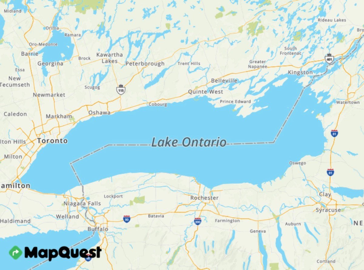
MapQuest’s unexpected return to the top of the App Store was not driven by a navigation breakthrough. It came from a two-word stand over the name of Lake Ontario: “We’re not.”
A legacy brand finds the moment
After the Trump administration pushed for “Lake America,” MapQuest posted that it would keep the familiar Lake Ontario label. The response traveled far beyond the company’s normal audience and turned a 30-year-old mapping service into a political symbol.
Downloads moved almost overnight
Appfigures estimated about 80,000 U.S. iOS downloads on Sunday, compared with a daily average near 500 in early August. Other market trackers recorded a similar order-of-magnitude increase, placing MapQuest ahead of far larger rivals in navigation charts.
The product became the message
People were not simply choosing routes; many were registering approval of the company’s position. That is powerful marketing, but it creates a challenge: users attracted by a news cycle will judge the app against Google and Apple on traffic data, search and reliability.
Can the comeback last?
Chart rankings measure momentum, not retention. MapQuest’s opportunity is to convert a burst of symbolic downloads into habitual use. The next meaningful numbers will be active users several weeks from now, not the peak position on one day.
The history behind the comeback
MapQuest launched in 1996 and became synonymous with printed turn-by-turn directions before smartphones. Google Maps and Apple Maps later pushed it out of daily cultural attention.
That history made the surge more surprising and more shareable: users were rediscovering a name associated with the early consumer internet.
What the ranking measures
App Store charts respond to download velocity, not total installed users or the quality of navigation. A smaller app can outrank an incumbent temporarily when its new installations spike.
That does not make the achievement meaningless. Top placement creates additional organic discovery and can extend the surge beyond the original political audience.
The Lake Ontario dispute
The administration directed federal agencies to adopt “Lake America,” while mapping providers made different choices about what users would see. MapQuest’s refusal became a concise contrast with larger platforms.
Geographic names are politically sensitive because maps feel authoritative. Providers already display disputed territories and names differently depending on a user’s location.
A rare brand-positioning opportunity
“We’re not changing it” worked because it was short, comprehensible and attached to the product itself. The statement did more than express an opinion; it told users what they would see inside the map.
Most corporate political messages are abstract. MapQuest’s was a visible product decision, which made downloading the app a form of participation.
Retention is the hard part
New users will compare routing accuracy, traffic, local search, privacy and battery use. A symbolic download becomes a business win only when people keep the app installed and open it for real journeys.
MapQuest can use the attention to explain features without overwhelming the reason users arrived. Product quality now has to carry momentum created by communications.
What competitors may learn
Smaller brands can sometimes move faster and take positions that dominant platforms avoid. But political differentiation can also alienate users and make every later mapping decision a test of consistency.
The lasting lesson is not that controversy guarantees growth. It is that a clear product choice can cut through a market where features otherwise look interchangeable.
Sources and verification
This report was prepared from current material available on September 2, 2026. Developing facts may change, and allegations are identified as allegations.
Editorial standard
Chitran Newsroom separates confirmed facts, contextual analysis and forward-looking interpretation. Corrections are made transparently when credible new evidence changes the record.